
Color psychology: how to choose your brand colors
Color psychology for your brand, without the myths: what a color can say, what it can't, and steps to choose and test your business colors.
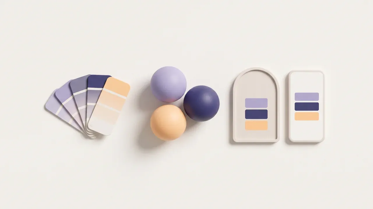
If you search for color psychology, you’ll find plenty of lists telling you what each color means: red is passion, blue is trust, green is nature. Those lists are a starting point, but a business owner needs something else: knowing how to choose brand colors that look good, get recognized and work on a sign, on Instagram and on a website. In this article I tell you how I think about it when I work on a logo, what you can expect from a color and what you can’t, and I give you some steps to choose and test yours.
What color psychology can actually give you
Colors trigger associations. The problem is that those associations aren’t fixed: they change with culture, industry, each person’s experience and, above all, with what the businesses your customer already knows are doing. The same green can make people think of health, a pharmacy, money or a sports team, depending on where they see it.
That’s why I don’t use tables of meanings as a rule. I use them as a question: which association helps me and which one gets in my way? What a color can do for your brand is quite specific:
- Help people recognize you. If you always use the same color, people start to spot you before they read your name.
- Put you in the right place. Some shades feel calmer and others more energetic. That helps your brand match what you offer.
- Set you apart. If every business on your street or in your industry uses the same color, choosing another one makes you easier to remember.
What a color can’t do is sell for you or convince anyone on its own. A logo in the “perfect” color won’t fix a confusing service or a website that doesn’t say what you do.
Three decisions before you choose a color
1. What you want your customer to feel
Write down three words that describe how you want someone to feel when they see your brand: calm, friendly, fast, caring, cheerful. Don’t think about colors yet. Those three words are the filter for everything else.
2. Which colors your industry already uses
Look up ten businesses like yours in your city on Google Maps or Instagram and write down their main colors. You’ll see patterns. Then you decide: do you want to look a little like them, so people quickly understand what you do, or stand apart, so they remember you? Both options are valid, but it’s worth choosing on purpose.
3. Where your brand is going to live
A color that looks beautiful on a screen can come out dull on a vinyl banner, or cost more than you expected in embroidery. Think about the real places: profile picture, sign, uniform, invoice, website. This is very close to what I explain about the types of logos and which one fits your business: shape and color are decided with the places they will be used in mind.
A simple palette: few colors, each with a job
For most small businesses, a three-part palette is enough:
- A main color. It’s the one people will associate with you. It goes in the logo and on the most important details.
- A supporting color. It goes along with the main one without competing with it. It works for backgrounds, headings or sections.
- A neutral. White, gray or a very dark shade for text and empty space. It’s the one used most and noticed least.
My own brand follows that idea: a dark indigo as the base color and an orange I save for the logo and the main buttons. If the orange were everywhere, it would stop drawing attention where it really matters.
It has to be readable: contrast isn’t optional
This is where many pretty palettes fail. Yellow text on white or light gray on a beige background looks elegant in a presentation and can’t be read on a phone in the sun.
For websites there’s a clear reference. The W3C’s WCAG accessibility guidelines ask for a minimum contrast of 4.5 to 1 for normal text and 3 to 1 for large text. The same guide makes clear that text that is part of a logo has no contrast requirement, but the text, buttons and menus on your website do. In practice, that means your main color may work in the logo, but it won’t always work for writing paragraphs on top of it.
There are free online tools that compare two colors and tell you whether they pass. It’s worth testing every text and background combination before you call the palette done.
A made-up example: an ice cream shop in Charleston
Imagine a small-batch ice cream shop in Charleston that wants to refresh its brand. Its three words are: fresh, cheerful, handmade. Looking at its industry, it sees that almost every ice cream shop in the area uses pink and light blue.
It decides to stand apart a little: it picks a mint green as the main color, a soft coral as the supporting color and a very dark brown, close to chocolate, for text. Before printing anything it tests three things: the logo as a small profile picture, the menu printed in black and white, and the brown text on the mint background on a phone outdoors. The text on mint is hard to read, so it keeps that only for large headings and uses a white background for paragraphs.
This case is made up. It doesn’t describe any client and it doesn’t promise results. It shows that choosing colors means making decisions and testing them, not looking up a meaning in a table.
Steps to choose and test your brand colors
- Write down three words that describe how you want your customer to feel.
- Note the colors of ten businesses in your industry and decide whether you want to look like them or stand apart.
- Choose a main color, a supporting color and a neutral. No more than three to start.
- Find the code for each color (the one that starts with #) and write it down. If you print a lot, ask your print shop which color reference they use.
- Test the logo at a small size, like a profile picture.
- Test a black-and-white version. If the logo only works in color, it will cause you trouble on stamps and invoices.
- Check the contrast of every text and background combination you plan to use on your website.
- Look at everything on a phone, with the brightness down and outdoors.
- Ask two or three real customers what it says to them, without first explaining what you were going for.
- Put it all in writing so no one changes it on their own.
That last step is exactly what brand guidelines solve, even if they are only one or two pages long. And when you bring the colors to your website, it helps to know in which parts of a website each one goes, especially the color of the contact button.
Frequently asked questions
What is color psychology?
It’s the study of how colors influence what people perceive and feel. In branding it’s used to think about which associations a color triggers, but those associations change with culture and context, so it’s best to take them as a guide and not as a rule.
How many colors should a small business brand have?
To start, three are usually enough: a main color, a supporting color and a neutral for text and backgrounds. You can always add one later if you really need it.
Is there a color that sells more?
There’s no color that works the same for every business. What helps most is that your color is consistent, easy to read and a good fit for what you offer.
Can I change my colors if I already have a logo?
Yes. Sometimes it is enough to adjust the shade or improve the contrast without changing the idea behind the logo. What matters is that, once it is decided, you use it the same way everywhere.
When I create a logo, you and I choose the colors together, I test them at real size and I give you the files with their codes and the color, white and black versions. You can see how I approach logo design and how I carry those colors over to your website. If you want to get your brand colors in order, get in touch and tell me what you have today.